
Bellomy Research Cloud Dashboards – User Guide
Introduction
Bellomy’s Dashboarding tool enables users to quickly create real-time data visualizations perfect for sharing with stakeholders.
Key Benefits:
- Create real-time data visualizations
- Export visualizations for reporting
- Share high-level results with stakeholders
Key Features:
- Select from a wide variety of visualizations
- Filter data for the entire dashboard or for individual charts/graphs
- Customize with appropriate color palettes
- Export graphs to PowerPoint or Excel in editable form (not just as images)
- Include additional elements such as text, pictures, and videos
Getting Started
Accessing Dashboards
From the homepage of the Research Cloud, select “Dashboards” under the Highlights menu.
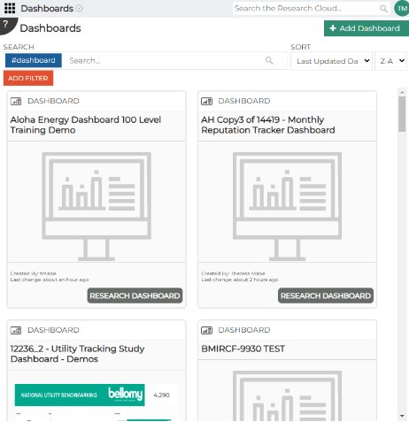
Adding/Opening Dashboards
Once in the Dashboards interface, you can:
- Create a new dashboard by clicking “+Add Dashboard”
- Open a previously created dashboard that either you created or has been shared with you
Note: Dashboards may be shared for viewing only or for viewing and editing. If you have been given editing rights, you will see “Enter Design Mode” as an option when you click on the dashboard.
Creating a Dashboard
Naming Your Dashboard
Once you click “+Add Dashboard” you will be required to give your dashboard a name.
Best practice: Be mindful of your audience when choosing a dashboard name. Choose something that will make sense to all stakeholders who may be using your dashboard.
Adding Data to the Dashboard
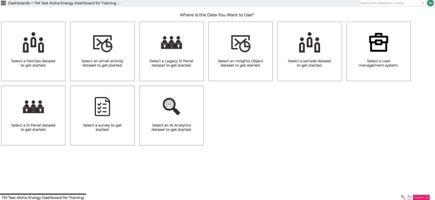
After naming the dashboard, you will need to select the appropriate data source.
Survey data will be the most common source of data for creating a dashboard. Select a survey to get started.
Finding the Correct Survey Data
Once you have selected to add survey data to your dashboard, you will need to find the appropriate survey.
You can:
- Browse through the available survey tiles
- Search based on survey name or number
Dashboard Components
A dashboard consists of three main components:
- Tiles
- Fields
- Widgets
Tiles
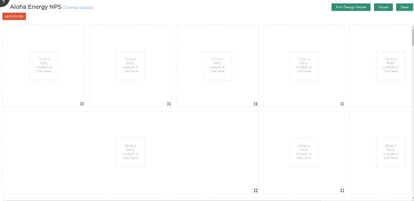
Tiles are the building blocks of the dashboard. You drop widgets and fields onto a tile to create a visualization or another dashboard feature (text box, image, video, etc.).
Tile Options
Once tiles have been created, you can:
- Clean up the title of the tile in the Caption Box
- Specify text and background colors
- Resize the tile
Resizing and Moving Tiles
Use the four-way arrows at the bottom right-hand corner of the tile to move tiles around on the page or resize them.
Resetting or Copying Tiles
- Choose the gear icon at the top right corner of the tile to reset the tile if you need to restart
- Right-click to copy and paste a tile in an additional space (helpful when creating similar graphs)
Fields
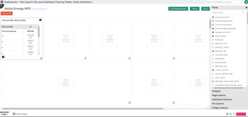
Fields come from your data source – typically the data collected in your survey.
If you first drag a field onto a tile, the dashboard system will auto-pick a visualization for you.
Field Customization
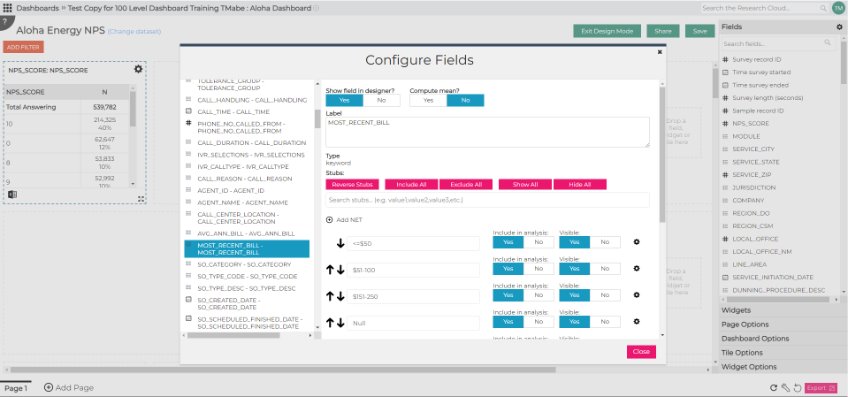
Fields can be customized using the gear icon at the top of the Fields menu. Customizations include:
- Changing the label for the field or field stubs
- Excluding certain stubs from analysis (or simply from visualization)
- Creating nets
Widgets
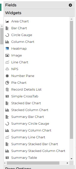
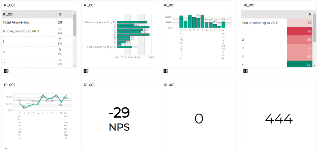
Widgets are the capabilities of the dashboarding tool – the different types of visualizations available, including:
- Charts (bar, line, column, pie)
- Tables
- Gauges
- Text boxes
- Images
- Videos
- Word clouds
Adding Widgets
If you know the type of visualization you want to create, you can:
- Start with the widget and add the field secondly
- Drag and drop your preferred widget onto an empty tile
- The dashboard system will wait for you to add data (from a field) to create the visualization
Changing Widget Type
To change the data visualization for a field, simply drag and drop a different widget onto the tile.
Widget Options
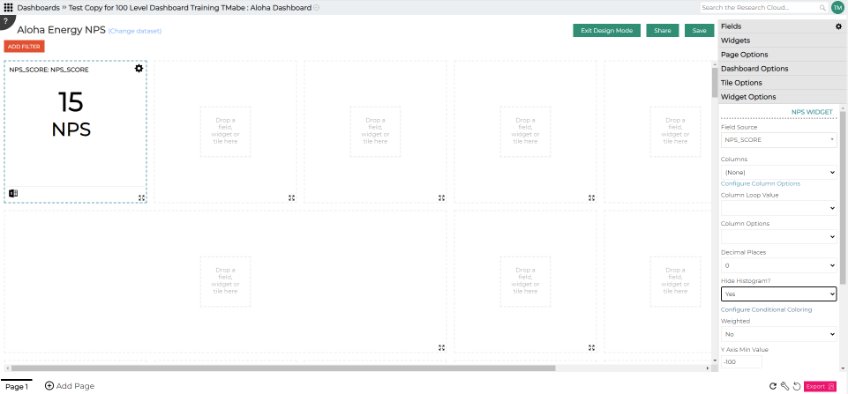
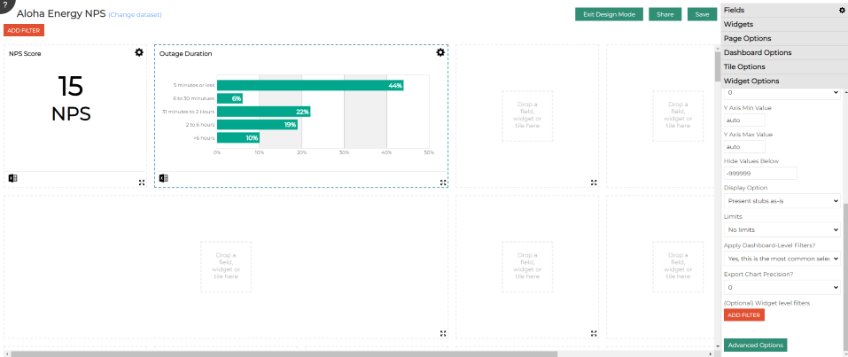
Once a widget is dropped onto a tile, the widget options menu will automatically open up, allowing you to:
- Specify values for columns and rows (depending on the widget type)
- Indicate if the data is weighted
- Apply filters specific to one particular widget (using the Add Filter button)
- Choose a specific color palette (using the Advanced Options button)
Overall Dashboard Options
Dashboard Color Palette
Users can choose from a variety of pre-programmed palette options or create a custom palette using hex or rgb numbers. This helps create a dashboard consistent with brand standards.
Dashboard Filters
At the top left corner of the dashboard screen, you can choose to ADD FILTER that will apply to the entire dashboard (unless you specify otherwise in a particular widget).
Example: A common filter would be for survey status to be “complete”.
Adding Multiple Pages
For dashboards containing lots of information, you can add pages to separate content or reduce scrolling:
- Click the +Add Page button at the bottom left corner of the page
Sharing the Dashboard
Click the Share button near the top right-hand corner of the screen to share your dashboard with others. This gives them view-only access.
Allowing Others to Edit
To give others editing rights to the dashboard:
- Choose the Configure Editor Team option in the Dashboard Options menu
- Add the users who should have edit permissions
Saving Your Dashboard
Click the Save button to save your dashboard.
- The button will be gray if you have saved but not made further changes
- It will be teal when there are changes to be saved
Important: SAVE EARLY, SAVE OFTEN, AND SAVE BEFORE YOU EXIT!
Exporting the Dashboard
Dashboards can be exported to Excel or PowerPoint:
- Charts and graphs will export in native format (not as images)
- They can be manipulated within PowerPoint and Excel after export
- Click the Export button at the bottom right of the screen
Viewing as an End User
After saving for the final time, click “Exit Design Mode” to view the dashboard as an end user will see it.