
Most relevant options are presented in the widget options pane within the dashboard designer. Sometimes, however, there is a need to adjust the palette specifically for a chart, or to apply custom attributes to the chart. The advanced chart options dialog allows for that.
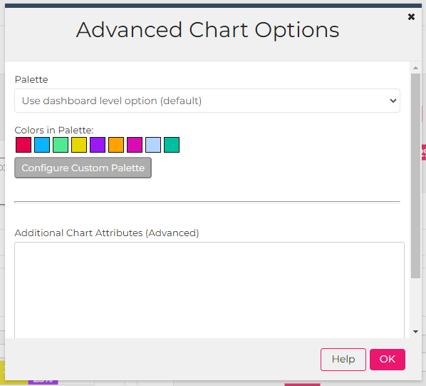
From this dialog you can customize the palette for the selected chart. Choose the “Customize the palette for this chart” option and design the palette to meet your needs.
The advanced chart attributes option is primarily to allow for a wide range of unforeseen customization needs that may come up. The library used for most charts, Fusion Charts, has a wide array of configuration options, much more than is normally needed to know about or adjust. However, in some cases it is necessary, so this allows for many of those attributes to be applied.
To use the advanced attributes, identify the attributes you want to set and enter them one attribute per line as shown here:
BGCOLOR=cecece
valueFontColor=ce0000
The list of possible attributes varies by chart type and the version of the chart we use, so it can be a bit of a moving target. The link below provides more information on this. Most attributes that apply at the “chart” level can be applied using advanced attributes.
https://www.fusioncharts.com/dev/chart-attributes/area2d
Common Examples
| rotateLabels=0 | to prevent axis data labels from being slanted |
| legendPosition=right | to put the chart legend to the right of the chart rather than underneath it (note: “left” doesn’t always work) |
| showValues=1 | to show data values that correspond to each slice on the pie chart |
| pieRadius=50 | to set the radius of a pie chart to 50 pixels |
| numDivLines=0 | on a column chart, to remove the horizontal lines that appear in the graph |
| formatNumberScale=0 | to prevent large numbers from automatically being abbreviated (e.g. instead of displaying 17K, display the actual value of 17,268) |